- Packages I will use to read in and plot the data.
- Read the data in from part 1.
Interactive Graph
- Start with the data
- Use e_charts to create an e_chart object with Date on the x-axis
- Use e_line to create a line graph to show the rise in temperature over time
- Use e_tooltip to add a tooltip that will display based on the axis values
- Use e_title to add a title, subtitle, and link to subtitle
- Use e_themes to change the theme to roma
- Use e_legend to center the legend and make it so that it does not cover the text
monthly_temperature_anomaly %>%
  e_charts(x = Date) %>%
  e_line(serie = Temperature_anomaly) %>%
  e_tooltip() %>%
  e_title(text = "Global warming: monthly temperature anomaly",
          subtext = "(in °C) Source: Our World in Data",
          sublink = "https://ourworldindata.org/explorers/climate-change",
          left = "center") %>%
  e_theme("roma") %>%
  e_legend(top = 40)
Static Graph
- Start with the data
- Use ggplot to create a new ggplot object. Use aes to indicate that Date will be mapped to the x axis; Temperature anomaly will be mapped to the y axis; color will be gradient based on the temperature anomaly
- Use geom_point to display the temperature anomaly
- Use theme_grey to change the theme of the graph
- Use ggtitle to add a title and subtitle to the graph
monthly_temperature_anomaly %>%
  ggplot(aes(x = Date, y = Temperature_anomaly, color = Temperature_anomaly)) +
  geom_point() +
  theme_grey() +
  ggtitle("Global warming: monthly temperature anomaly",
          subtitle = "(in °C) Source: Our World in Data")
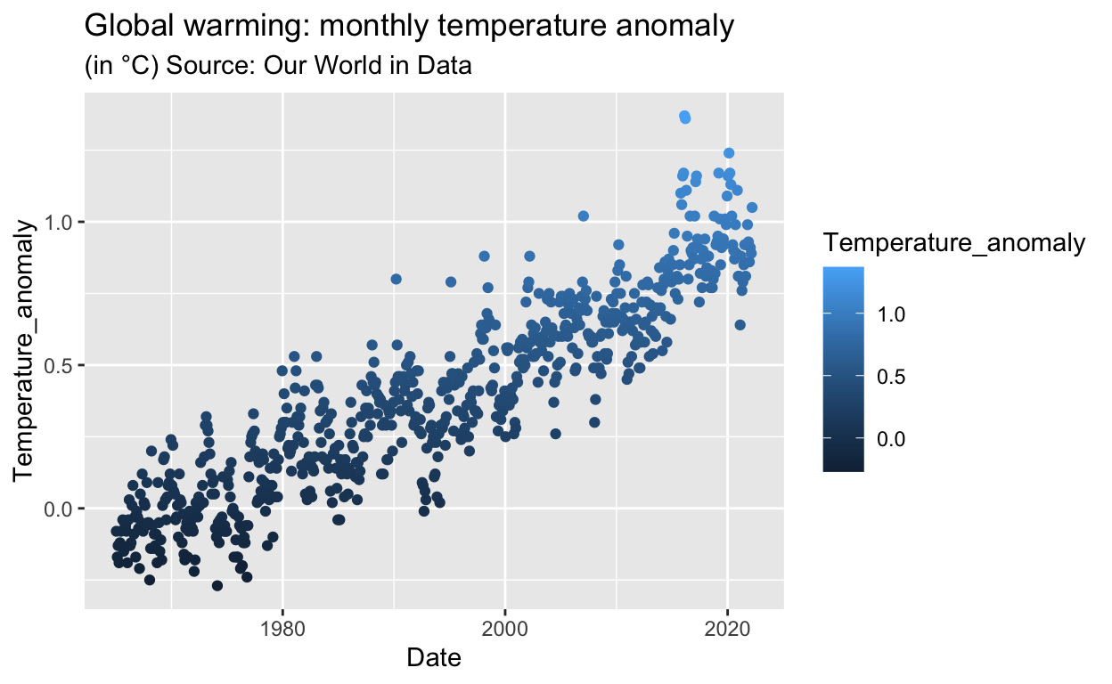
These plots show a steady increase in temperature since 1965. Climate change is increasing.